The Sam Silva brand.
v1 · 2026
"Editorial Signal": a cool ink-and-paper surface built for reading, one confident signal blue for links and action, a serif display face (Fraunces) for editorial weight, and a clean sans (Geist) plus mono for the record.
Identity
Mark and wordmark.
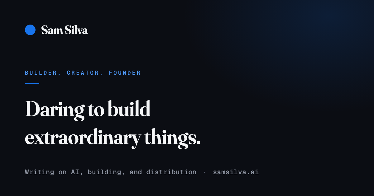
A single signal-blue disc as the mark, paired with a plain "Sam Silva" wordmark in the heading face. The disc holds one fixed blue in both modes — a logo keeps its color — while the wordmark carries the ink or white of its context. The same disc anchors the favicon and the social card, so the identity reads the same everywhere.
Lockup
Fraunces · semibold · disc mark paired with the wordmark
Scale
One disc at every size, the same signal blue
Color
Ink, paper, and one signal.
Cool neutrals carry everything. The signal blue appears in small doses where it means a link or an action. On light surfaces, signal-600 and deeper are the only text blues; signal-500 is reserved for graphics.
Cool neutrals
paper
#f9fafc
Page canvas
surface
#fdfeff
Raised cards
linen
#f0f2f4
Quiet fills
mist
#e2e5e9
Hairlines, borders
stone
#646972
Muted text (AA on paper)
ink-soft
#3f4349
Secondary text
ink
#171b22
Primary text, buttons
black
#0d0f15
Dark-mode canvas
Signal accent
signal-050
#edf6ff
Wash, hover tint
signal-100
#d7eaff
Tints, selection
signal-300
#7ab0f9
Large accents on dark
signal-400
#4f99f9
Accent text on dark
signal-500
#1874ed
Accent core. Graphic-only on light
signal-600
#0058d5
Signal as text on light
signal-700
#1346ab
Deep signal, hover state
On light
Ink on paper for prose. Signal-600 for links and accents. Stone for supporting text.
On dark
Cool white on near-black. Signal-400 carries the accent. Fog for supporting text.
Typography
A serif for display, a sans for prose.
Fraunces, a variable display serif, sets headings and gives the page editorial weight. Geist carries prose and UI; Geist Mono, a neutral programming face, handles labels, dates, and figures. All three are open licensed and self-hosted.
Display
Fraunces / 60px / semibold / -0.02em
The best ideas read simply
Title
Fraunces / 36px / semibold / -0.01em
The best ideas read simply
Heading
Fraunces / 24px / semibold
The best ideas read simply
Body
Geist / 17px / regular / 1.75
The best ideas read simply
Small
Geist / 14px / regular / 1.6
The best ideas read simply
Label
Geist Mono / 11px / caps / 0.14em
The best ideas read simply
Geist Mono figures
0123456789
published 2026-07-02 · 6 min read · filed under agents
In use
The tokens at work.
Shared shadcn/ui components from the workspace library, rendered with nothing but the brand tokens. No component ships custom colors.
Buttons
Badges
Form
Brand pack
The identity assets.
The downloadable identity set, built to this system and reused off-site (newsletter, social, thumbnails). Sizes are pinned by tests; when the mark changes, every asset is regenerated together.
Principles
Six rules the system keeps.
Flat, not rendered
Flat color, crisp edges, restrained radii. No gradients, no bevels, no sheen — the surface stays quiet so the writing carries the page.
Hairlines, not shadows
Structure comes from one-pixel rules and spacing. Elevation is reserved for surfaces that truly float.
The signal means something
The blue marks links and action. It never decorates. Most of any page is ink and paper.
Mono is for the record
Geist Mono carries labels, figures, dates, and anything that reads as evidence. Prose stays in the sans.
Contrast is computed
Every text-on-surface pair is verified against WCAG AA in both modes before it ships. Nothing is eyeballed.
Motion earns its place
A calm reveal on entry, a considered hover, nothing perpetual. Reduced-motion preferences collapse it all to static.